When analyzing charts for trading, chart patterns play a crucial role. In technical analysis, these patterns provide indications of changes in trends. By learning about these chart patterns, you can understand how to benefit from these technical price patterns. But before you start analyzing these patterns, it’s better to learn about them.
Learning about these chart patterns will help you make more informed decisions when trading in the stock market. They provide valuable insights into potential price movements, and by understanding them, you can enhance your trading strategies.
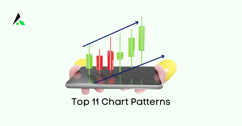
To get grips with them, here are the top 11 chart patterns that every trader should know when trading in the stock market. But before knowing that let us discuss the basics of the chart patterns.
What are Chart Patterns?
Chart patterns represent price movements in financial markets, such as stocks, currencies, commodities, etc. These patterns are created by plotting the prices of an asset over a specific period, typically using a line chart or candlestick chart. Traders and analysts use chart patterns to identify potential trends, reversals, and trading opportunities.
Chart patterns are a fundamental component of technical analysis, a method of analyzing financial markets based on historical price data. Traders and investors use these patterns to make predictions about future price movements and to set entry and exit points for their trades. By recognizing and interpreting chart patterns, market participants can gain valuable insights into market sentiment and make informed trading decisions.
Also Read: 30 Candlestick Patterns and Charts Every Trader Should Know
Type of Chart Patterns
Chart patterns can be basically classified into:
- Reversal patterns
- Continuation patterns
- Bilateral Patterns
Reversal Patterns
Reversal patterns indicate a potential change in the current trend. Traders use these patterns to spot opportunities to enter trades in the opposite direction of the prevailing trend.
Continuation patterns
These patterns suggest that the prevailing trend is likely to continue. Traders look for these patterns to identify opportunities to enter trades in the direction of the existing trend.
Bilateral Patterns
Bilateral chart patterns let traders know that the price could move either way – meaning the market is highly volatile.
Reversal Patterns
Double bottom ( W Pattern )
The Double Bottom is a rapid reversal pattern that appears after a decline in the price of an asset. It features two low points that reach a similar price level, with a peak (a high point) in between.
The first trough represents the initial low, and the peak represents a temporary rally. The second trough, often close to the first in terms of price, signals a potential trend reversal from bearish to bullish.
Traders see the Double Bottom as a signal of a possible change in market sentiment from bearish to bullish.
The pattern is confirmed when the price breaks above the peak or a resistance level, indicating a shift in market sentiment from bearish to bullish.

Double Top (M Pattern)
The Double Top is a bearish reversal pattern that occurs after an extended uptrend in financial assets.
In this pattern, there are two distinct peaks that reach a similar price level with a trough (a low point) between them.
The first peak represents the initial high, and the trough represents a temporary pullback.
The second peak, often close to the first in terms of price, signals a failure to sustain the upward momentum.
Traders interpret the Double Top as a warning of a potential trend reversal from bullish (upward) to bearish (downward).
The pattern is confirmed when the price breaks below the trough or a support level, indicating a shift in market sentiment from bullish to bearish.

Learn Details: Understanding Support and Resistance Trend Analysis
Wedges
Wedges form as an asset’s price movements tighten between two sloping trend lines. There are two types of wedges: rising and falling.
Rising Wedge: In a Rising Wedge, the upper trendline slopes more steeply than the lower trendline. This pattern typically forms after an uptrend and suggests that the upward momentum may be weakening. Traders often interpret a breakout below the lower trendline as a bearish signal, indicating a potential trend reversal or a move to the downside.

Falling Wedge: In a falling wedge, the lower trendline slopes at a steeper angle than the upper trendline. This pattern typically forms after a downtrend and suggests that the bearish pressure may be waning. Traders often view a breakout above the upper trendline as a bullish signal, indicating a potential trend reversal or an upward move.

Learn Details: What is Trendline, How to draw a Trendline, How to It use?
Pennant Patterns
The Pennant pattern or Flag pattern forms when a stock experiences a rapid upward or downward movement. Identifying the flagpole for the Flag pattern is crucial. Look for a strong and clear price movement in one direction with consistent bars, intervals, and strong volume.
For a Bullish Flag pattern, we need to identify the flagpole as a rapid upward movement. The flag is formed by two parallel lines that slope downward. In this pattern, we look for a continuation of the prior uptrend after a brief consolidation, represented by the flag.
In a Bearish Flag pattern, the flagpole is characterized by a rapid downward movement. The lines forming the flag are also parallel, but they slope upward. In this pattern, the flag suggests a temporary consolidation before a potential continuation of the previous downtrend.
Understanding these patterns and their components, such as flagpoles and flags, is essential for traders who utilize technical analysis to make informed decisions in the stock market.
Continuation patterns
Ascending Triangles
The Ascending Triangle is a bullish continuation pattern that illustrates a consistent uptrend. Ascending triangles can be drawn on a chart by connecting swing highs with a horizontal line representing resistance and then drawing an ascending trendline along the swing lows to reduce the support.
In ascending triangles, often two or more equal highs are present, allowing the drawing of a horizontal line, indicating resistance. Simultaneously, an ascending trendline can be drawn along the swing lows, indicating a gradual increase in support.
The trendline pattern illustrates the overall uptrend, while the horizontal line suggests a historical level of resistance for that particular asset. The breakout from the pattern, typically to the upside, indicates a potential continuation of the prevailing uptrend.

Descending Triangles
The Descending Triangle is a bearish continuation pattern that forms when the price of security consistently creates lower highs while maintaining a horizontal support level. A breakdown below the triangle indicates that bearish momentum is increasing, signaling a potential further decline in the market.
The best scenario for the emergence of this pattern is during a market downturn.

Symmetrical Triangles
Symmetrical Triangles can be bullish or bearish continuation chart patterns that are developed by two trend lines that converge. These two trend lines join the peaks and troughs and they occur in the direction of the ongoing trend.

Head and Shoulders
The Head and Shoulders pattern is a bearish reversal pattern that forms when the price of security creates three peaks separated by pullbacks, which shape the pattern’s neckline.
In this pattern, the central peak, known as the head, is higher than the two shoulders on either side. The pattern suggests that buyers, after attempting to push the price higher, have become exhausted, and sellers have gained dominance. When the price breaks below the neckline of the pattern, it signals a reversal to a bearish trend in the market.

Inverted Head and Shoulder Pattern
The Inverted Head and Shoulders pattern is a rapid reversal pattern that forms when the price of security creates three consecutive bottoms separated by pullbacks, shaping the pattern’s neckline.
In this pattern, the central bottom, known as the head, is lower than the two bottoms on either side. The pattern indicates that sellers, after attempting to push the price lower, have become exhausted, and buyers have gained control. When the price breaks above the neckline of the pattern, it signals a reversal to a bullish trend in the market.

Rounding Bottom
The Rounding Bottom is one of the stock chart patterns that indicates a reversal or a turnaround. The most common Rounding Bottom pattern is a bullish reversal. It appears in a ‘U’ shape and typically forms at the end of an extended downtrend.
This is a long-term price reversal that takes several weeks or months to develop. The initial downward slope indicates additional selling or supply, which eventually transforms into an uptrend as buyers enter the market at lower prices. Once the formation of the rounded bottom is complete, prices break above, signaling a change in sentiment as buyers enter the market at lower prices.

The Rounding Bottom is a signal of a potential trend reversal, and once the formation of the rounded bottom is confirmed, prices often break to the upside, indicating a sustained uptrend.
Cup and Handle
The Cup and Handle pattern is a bullish chart pattern in technical analysis that often signals a potential trend reversal from a downtrend to an uptrend. This pattern is named because it resembles the shape of a teacup, with a rounded bottom (the cup) and a smaller consolidation period near the top (the handle). It typically signifies a period of accumulation followed by a breakout.
You can read our book Price Action Trading Beginner to Advance to boost your trading knowledge. This book covers basic to advanced price action trading concepts, including trading strategies, candlestick patterns, chart patterns, technical analysis, volume analysis risk management, and trading psychology. you can buy the book from Amazon or Flipkart.
FAQs:
Which chart pattern is best for trading?
Best chart pattern for trading. Success depends on strategy, risk tolerance, and market conditions. Common patterns include triangles, flags, and head and shoulders.
What chart do most traders use?
Most traders commonly use candlestick charts due to their visual clarity, displaying open, high, low, and close prices effectively.
Which time frame is best for chart patterns?
The best time frame for chart patterns depends on trading goals. Short-term traders often use intraday charts (1-15 minutes), while swing traders prefer hourly or daily charts. Long-term investors may use weekly or monthly charts.
Final Thought
Understanding these ten chart patterns is essential for traders looking to make informed decisions in the financial markets. While various factors influence trading success, recognizing these patterns and interpreting them correctly can significantly enhance your trading strategies. By incorporating technical analysis and keeping an eye on these chart patterns, you’ll be better equipped to navigate the complex world of trading and make more informed decisions based on the valuable insights they provide.

